Business Marketing Group
Introduction
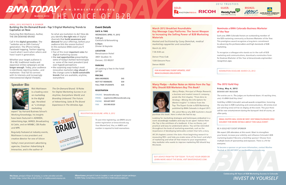
I have been a member of BMA Colorado for nearly 6 months, and have been recommended by a colleague to the board the opportunity to work on a publication as her term was up. I was honored and gladly volunteered to work on the BMA Today newsletter, which appears in The Review, a monthly magazine and online publication. It’s a full two page spread, highlighting the Colorado Chapter monthly upcoming events, roundtables, luncheons, speakers, and workshops. This month, I had the opportunity to redesign and make it appear as it were my own while in keeping with the current brand.
Design Solutions
The masthead and footer had to stay pretty much the same in keeping with the current brand. The graphic elements, color in the masthead stayed consistent. What did change, I wasn’t exactly thrilled how stark the sponsor information was along the top. Luckily, I was able to remove one of the sponsors which helped open the space up a bit and easily made the logos a little larger. So, what I did to soften the space a little more was add a cream background with a rounded corner box and gradient to make it pop just a tad more, but still very subtle. So, anytime I would treat the content area with a cream box, it would tie the two together, and your eye tend to move around the page.
Sometimes fitting content can be a challenge. It was really important to highlight the speaker information with day of event information. I had to even add new information which made it a challenge to fit all in the right column, and the client kept adding more and more content for that area. Also, Advise from the Top book image with content was laid out in a way to really pop along with calling out thanking it’s volunteers. Above, there was even room to add three small images along the top for each article to call it since it was on it’s own page, which some may just want to skip over this page. Using images are a good way to move your eye quickly as possible to pick up the information as quickly as possible and is most appealing to read.
I like this particular layout as there is a lot of white space to help keep your eye moving around the page. Every month probably could expect more and more content, which will create new and exciting challenges.
To review online: BMA Today